1. Open Theme settings
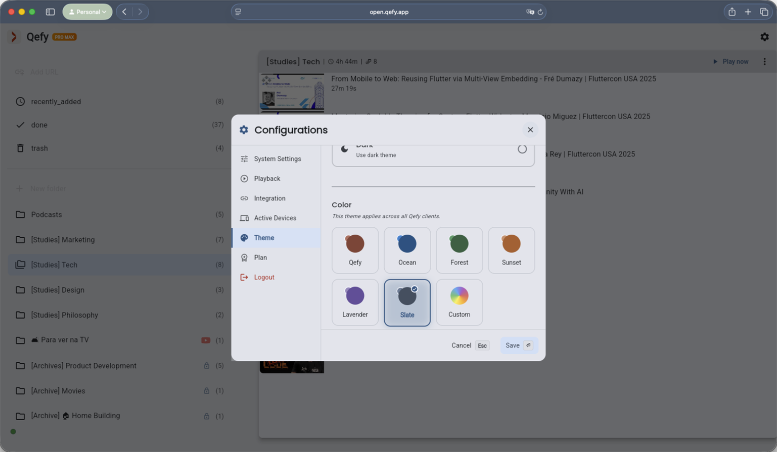
In the QueueFy web app, open Settings / Configurations and go to the Theme tab. This is where theme preferences are managed.
Make QueueFy comfortable for long sessions. Customize light/dark mode, accent color, and contrast for clarity and focus.
Try QueueFyBy the QueueFy teamLast reviewed:
Custom themes let you personalize QueueFy’s appearance: theme mode (light/dark/system), accent color, and contrast. QueueFy also applies theme preferences to the web experience and can tint parts of the browser UI for a more cohesive feel.
In the QueueFy web app, open Settings / Configurations and go to the Theme tab. This is where theme preferences are managed.
Pick Light, Dark, or System. System follows your device preference; explicit Light/Dark overrides it.
Select a color you like. QueueFy uses it as the base for accent styling across the UI so key actions and highlights match your preference.
If available, choose a contrast level that works for your environment and eyesight. Higher contrast can improve scanability in dense lists.
When you open the browser extension, it applies your theme preferences so the popup matches the app.
Extension tutorial